Weekly Inflation Outlook: Have We Seen the Peak?
2022.12.05 11:27
[ad_1]
On Friday, investors freaked out a bit when the showed not just a slightly-higher-than-expected growth in new jobs but also a significant miss to the high side on (AHE) along with a big upward revision to prior months.
First point to make: if you’re looking at an economic series that has large and frequent revisions, you shouldn’t make big decisions on the basis of it.
For example, let’s suppose you are the head of the world’s largest and most powerful central bank, and you believe (for some reason contrary to what the data suggest) that inflation is partly caused by high wages, so that you need wages to fall in order to have inflation fall. If you were such a person, and believed such a thing, then what you most certainly should not do is rely on average hourly earnings to tell you what wages are doing.
Unfortunately, Chairman Powell last week said exactly those things. The Fed wants to see wages decline to something “consistent with 2% inflation,” and he specifically mentioned AHE. More nonsense from central bankers. Never mind that all sorts of wages are consistent with 2% inflation—the whole “Phillips Curve is broken” meme was based on the re-interpretation (post-Phillips) of the curve as relating unemployment to inflation rather than to wages, and since wages and inflation are not tightly bound it means the Phillips Curve defined a way that Phillips didn’t define it doesn’t work. So that’s strike one. But if you were an economist in charge of monetary policy and you insisted on believing that a certain level of wage growth is “consistent with 2% inflation,” you certainly would not measure that wage growth with AHE!
That’s partly because AHE is volatile and frequently-revised, and partly because it is highly sensitive to the composition of the workforce. When new entrants to the labor market are largely in low-skilled industries, it biases the average lower, and vice-versa. Heck, average anything—including and , compared to their median counterparts—is fraught. But AHE is particularly bad.
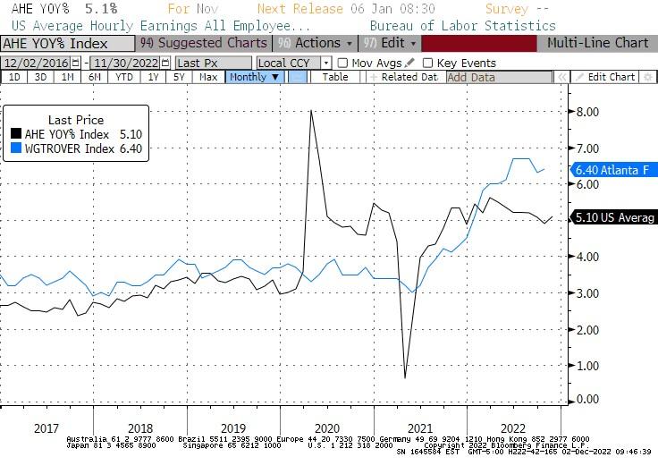
Here is a chart showing AHE and the Atlanta Fed’s Wage Growth Tracker. The WGT tracks the median wage of people in the sample who were employed at both the beginning and end of the sample period. Ergo, there is no change in the sample composition. It is both more stable, and (as I’ve shown previously) has been much more stable with respect to median inflation. There is no noticeable and stable relationship between AHE and CPI.
 Average Hourly Earnings YoY
Source: Bloomberg
How can a serious economist look at the black line in that chart, which is AHE, and use it for anything? Do you notice anything off-putting about it?
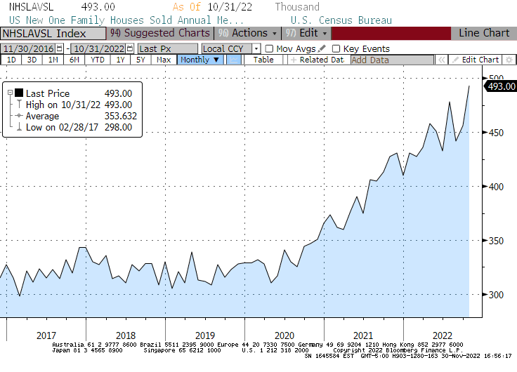
Let’s move on. Last week also saw the release of the S&P Case-Shiller Housing Price Index. This index is probably the best home price index, but its lags make it difficult for forecasting. The news, though, was consonant with other recent housing market releases. Various economic indicators have shown that while the increase in mortgage rates has depressed transactions volume in the housing market, and listed offers have come down closer to prior transactions, the actual prices transacted have not collapsed in the way some people predicted. Indeed, the median price of a new home reached an all-time high, with the third-strongest October since 2000.
 Median Price New Homes Sold
Source: Bloomberg
Now, the Median Price series is much more volatile than the one for Existing Homes (which declined seasonally), and there are many more “existing” homes than “new” homes so I tend to lean on the numbers more. The point, though, is that there is no evident collapse. With mortgage rates likely either near or past their peaks, if there hasn’t been a collapse yet I’m not sure where one will come from. I think it will be a while, though, before housing bears back off on that story.
Taking a Step Back…
Yes, inflation has peaked.
And the good news is that money growth appears to be steadying. The Fed may deserve some credit for this, especially if money growth really does stay at zero for a while. Remember, the whole way that monetary policy is being operated right now is a total experiment; the central bank has never before tried to slow inflation with rate hikes alone without reining in the quantity of reserves. They might have great models but it has never been tried. Ergo, if they end up succeeding not just in pushing inflation down (it was going to go down naturally somewhat anyway) but in pushing it back to 2%, then they’ll deserve a lot of credit for those models. Personally, I think there is enough reason to be skeptical of their models that I’ll withhold judgment until we get to 2%.
I don’t think that will be any time soon. There is still plenty of pipeline monetary pressure caused by the prior increase in the money supply, and plenty of large systematic/secular pressures (such as demographics and deglobalization) that will tend to keep inflation higher than it otherwise would be.
Here’s the Big Picture
Between December 1992 and December 2019, M2 grew an aggregate of 347% (5.71% per annum). Real GDP increased 95.3% (2.51% p.a.), and the price level (using CPI) rose 81.1% (2.22% p.a.). By definition, the sum of changes in GDP and the price level, 4.74% per annum, is approximately equal to the sum of the changes in the money supply and money velocity; so, we know that the difference was declining V (since M2 was +5.71% and that’s more than 4.74%).
The declining velocity of money made possible the good outcome of 2.5% growth and 2.2% inflation, given 5.7% money growth. If V had instead been constant, we wouldn’t have had 3.5% growth—the economy just can’t do that. We would have had more inflation. So, we got a lucky break with declining V (or you can think of the one-time globalization and demographics dividend as the lucky break that allowed us to grow money ‘too fast’ and still get solid growth and low inflation).
Either way, that’s a one-time lucky break. Going forward, M2 really can’t grow much faster than 2.5%+2%=4.5% if you want stable inflation, and possibly less than that since globalization and demographics trends are reversing. That’s the big picture in the long term.
In the short term: Since the end of 2019, M2 is +40.4%, GDP +4.3% (total, not annualized), and prices +15.5%. This has coincided (caused?) a massive decline in money velocity…which is in the process of correcting.
So in my view, the path of inflation from here looks like this: steadily high-ish inflation for a few years—think a 4% handle as being an optimistic outcome—which transitions into lower inflation that will still seem higher compared to what we became used to over the last quarter-century. Say, mid 3%. As I said, if the Fed really sticks the landing, and commits to lower money growth going forward than it has historically been comfortable with, then this doesn’t have to happen. But for that to happen, it will also be necessary to have fewer economic/financial crack-ups that “require” monetary policy ministrations that somehow always involve much more money.
And therein lies the rub: slower money growth probably implies more crack-ups are likely. Hmmm.
Disclosure: My company and/or funds and accounts we manage have positions in inflation-indexed bonds and various commodity and financial futures products and ETFs, that may be mentioned from time to time in this column.
[ad_2]
Source link


