Time to Embrace Bond Yields and Reduce Equity Exposure?
2023.05.10 08:34
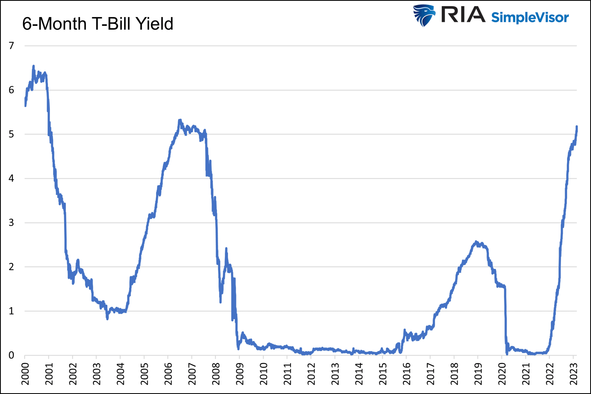
Today an investor can earn a 4%+ return with zero risk. For the last 15 years, such would be called a pipe dream. Today it’s reality. Consequently, investors face a risk-free rate not far from historical equity returns. This setup presents investors with options with which they are mainly unfamiliar.
With the Fed purposely trying to slow economic growth and a banking crisis in full swing, do the heightened risks argue investors should gladly accept the current bond yields and reduce equity exposure?
To help you appreciate the question, we get wonky with statistics. This article visualizes risk and return profiles in different market environments and monetary policy stances. The goal is to show how changes in market tone and or the Fed’s rate policy alter equities’ expected risk and returns profile.
Key Takeaways
- Statistics allow us to quantify and compare risk and return probabilities for assets.
- Fat tails increase the odds of more risk and return than one might expect.
- We share distribution curves for bull versus bear markets, QE versus QT, and changes in the Fed Funds rate.
Statistics 101- Bell Curves
Before we visualize risk and return profiles in different environments, it’s worth brushing up on statistics.
A normal data distribution has perfectly symmetrical returns. For example, if there are six days with a 2.456% gain over four years, there are also six with a 2.456% loss. A perfect bell curve distribution does not occur with stock returns and is a rarity in almost every data set. Regardless, the closer a collection of historical returns resembles a normal distribution, the more confidently we can quantify risk and return expectations.
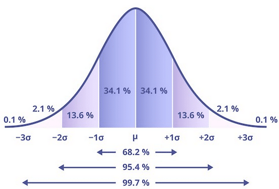
Normal Bell Curve
S&P 500 Return Distribution
Below are daily returns since 1970. While the curve looks like the one above, it is far from a perfect distribution.
The area graph above shows the percentage of instances where the range of returns on the x-axis occurred. For example, the most common instance, accounting for 14% of the trading days, is a slight gain between zero and 0.25%. Note the x-axis is in .25% increments except beyond +/-3%, at which point we group occurrences into more extensive ranges.
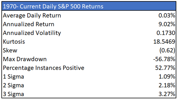
We summarize the graph in the table below.
S&P 500 Returns Table
The graph is far from a normal distribution. For example, a three-standard deviation (sigma) move includes gains of 3.30% or more and losses of 3.24% or worse. Three sigma events happened 183 times or 1.4% of the time. In a normal distribution, such outlier events should occur once every 2.85 years or 19 times in the 53-year history we present.
The actual occurrence was 10x as frequent. More stunning, there were 36 five standard deviation events. There should only be one every 13,843 years! The bottom line is that the risk of greater-than-expected gains or losses is much more than expected in a perfectly distributed bell-shaped curve.
Fat Tails
Statisticians refer to this phenomenon as fat tails and measure it with kurtosis. The larger the kurtosis, the fatter the tails, i.e., the greater the risks. Conversely, a negative kurtosis indicates the data is more centered around the mean with less risk than a normal curve would suggest.
Skew is another stat describing the shape of the curve. Skew measures how symmetrical a curve is. The data is considered fairly symmetrical if the skew is between -0.5 and +0.5. Beyond those bounds, the skewness increases.
The critical consideration is that most risk models assume a normal-shaped curve. Therefore, the more skew and kurtosis, the more we underestimate the odds of unwelcome outcomes.
Bull vs. Bear Market Returns
With a basic understanding of distribution curves and statistics to help appreciate them, we visualize returns in various market environments.
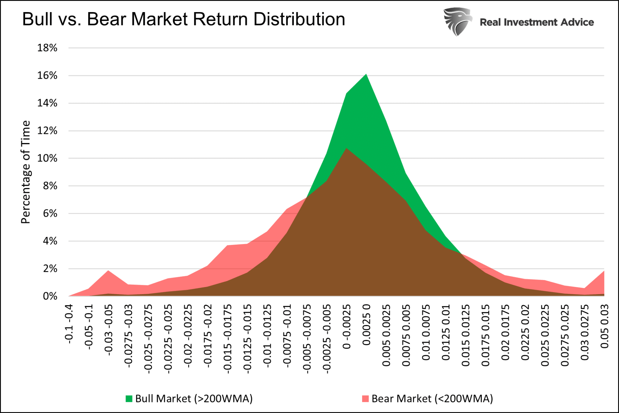
We start with a comparison of bull and bear markets since 1970. For this analysis, we consider the S&P 500 in a bull market when its price is above its 200-day moving average (DMA) and in a bear market when below the 200-dma.
The graph below compares bull and bear market histograms. Bear markets have a much flatter-shaped curve with fatter tails. Fat tails in bear markets result from large and more frequent positive and negative returns.
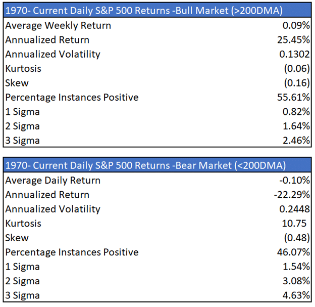
As shown in the table, the kurtosis of bear markets is 10.75, indicating fatter tails. The bull market distribution has a kurtosis and skew near zero. The bull market return distribution is much more normal than the bear market distribution.
 Bull Vs. Bear Market Returns
The tables below further highlight the differences. Annualized volatility is almost twice as high in a bear market than in a bull market. As they say, bull markets take the steps up, while bear markets take the elevator down.
Bull Market Returns Table
Active QE Vs. QT
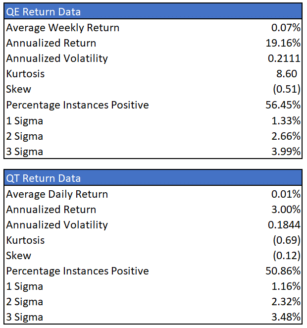
Next, we compare periods where the Fed actively adds to its balance sheet (QE) versus those when they actively reduce its balance sheet (QT). The data is from 2008 to the current.
Periods in which the Fed was doing QT are slightly skewed to the left versus periods of QE. It is important to realize that QE often began when stocks were declining. Therefore, QE tends to include bullish and bearish trends.
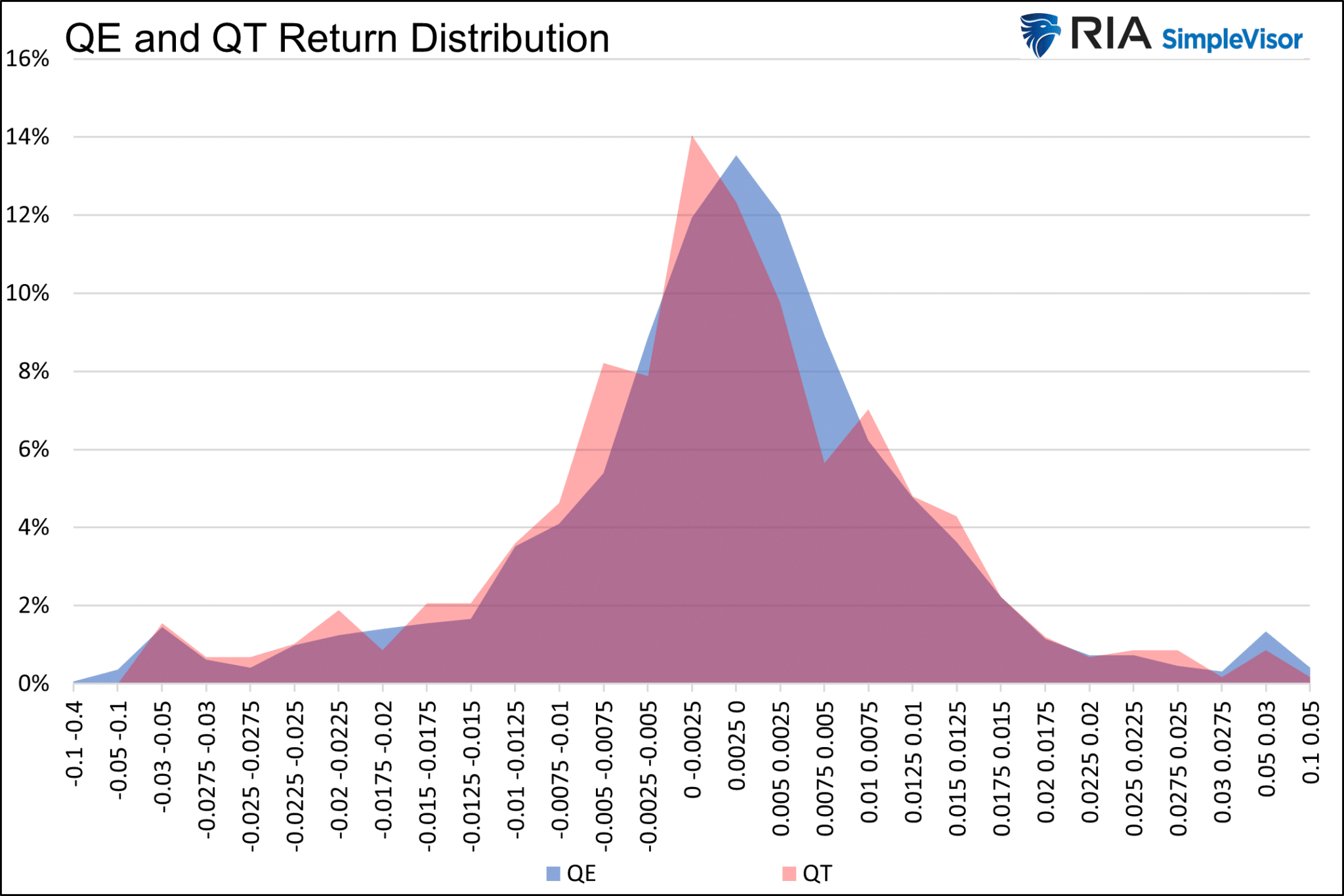
The data tables below do not provide much insight. The periods of QE and QT have a similar distribution of returns. However, returns tend to be significantly better during QE.
Further, the percentage of positive daily returns during QE is slightly higher than in bull markets. QE is unequivocally bullish, but QT may not be as bearish as many believe.
We caveat the results as the QT periods are limited to 2018, half of 2019, and the second half of 2022.
QE-QT Returns Table
Change in Fed Funds
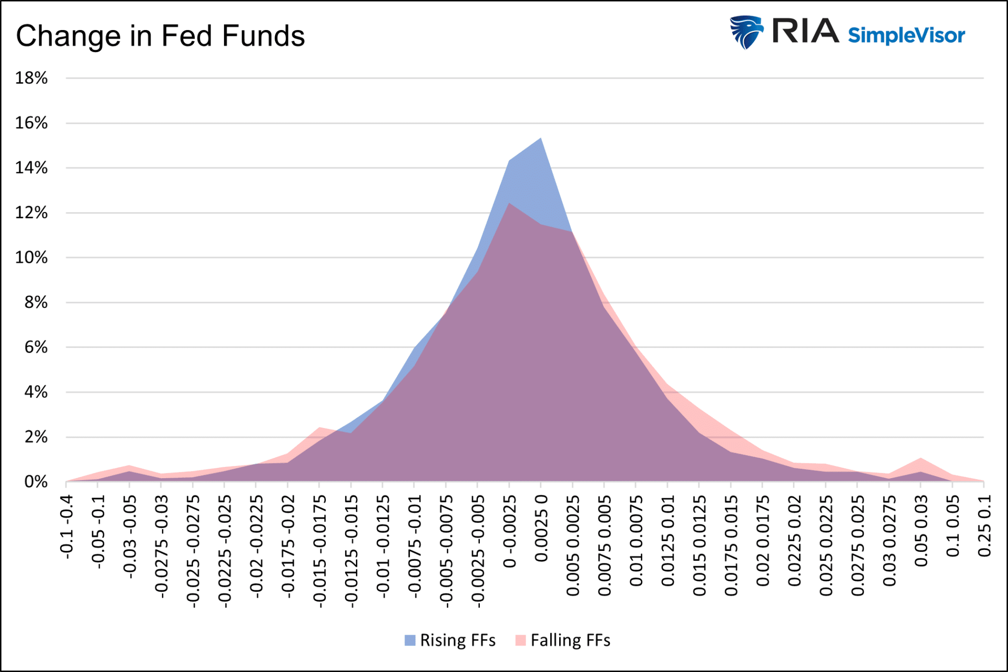
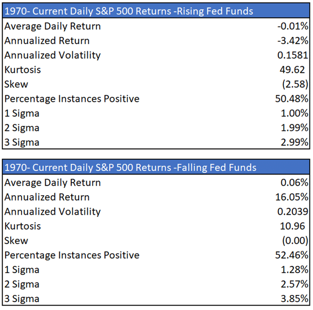
The graph above and the tables below point to weak returns, relatively high kurtosis, and highly negatively skewed returns when the Fed raises interest rates. However, volatility tends to run low during these periods.
The Fed often raises rates at the end of periods of above-average growth and into the beginning of recessions. Periods when the Fed reduces rates, tend to lead to better returns, albeit with heightened volatility.
Fed Funds Returns Table
Summary
A risk-free 4% return seems like a good option if a recession ensues and the market follows 2022’s path lower. As we demonstrated, volatility increases while returns falter in bear markets.
However, the analysis was less clear about how the current Fed policy stance regarding QT and higher rates statistically affects returns. As we uncovered, the problem with our research is that periods of QT and higher rates spanned bullish and bearish trends.
Based on this analysis, the market trend may be the most crucial factor for considering risk and return. When the market trades above its 200-day moving average, the average daily returns are much greater than the average since 1970, and volatility is much lower.
Conversely, bear markets produce horrible returns, higher volatility, and a more abnormal distribution of returns.
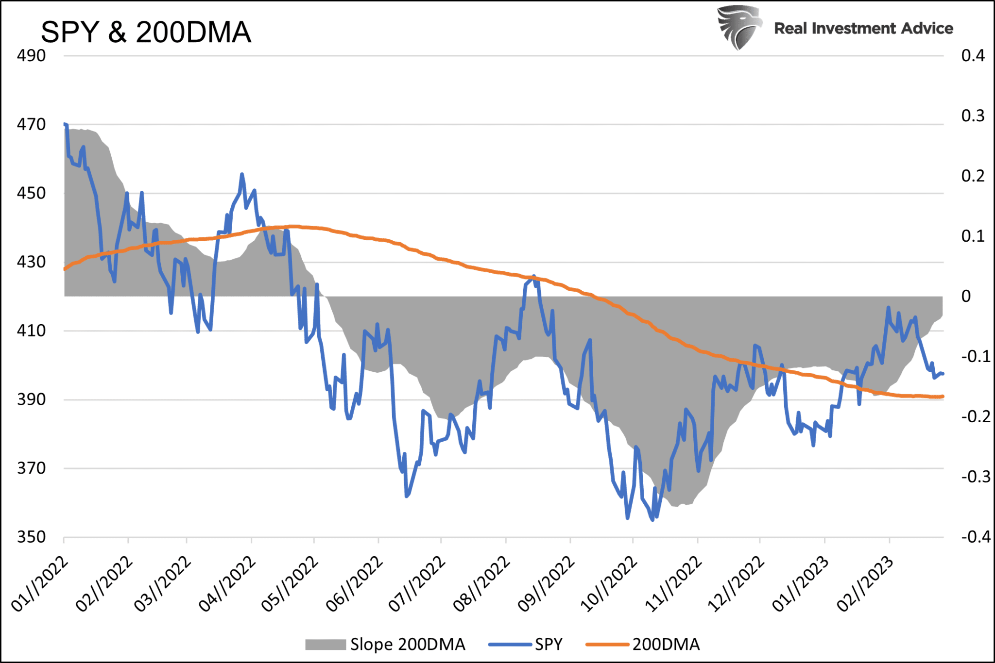
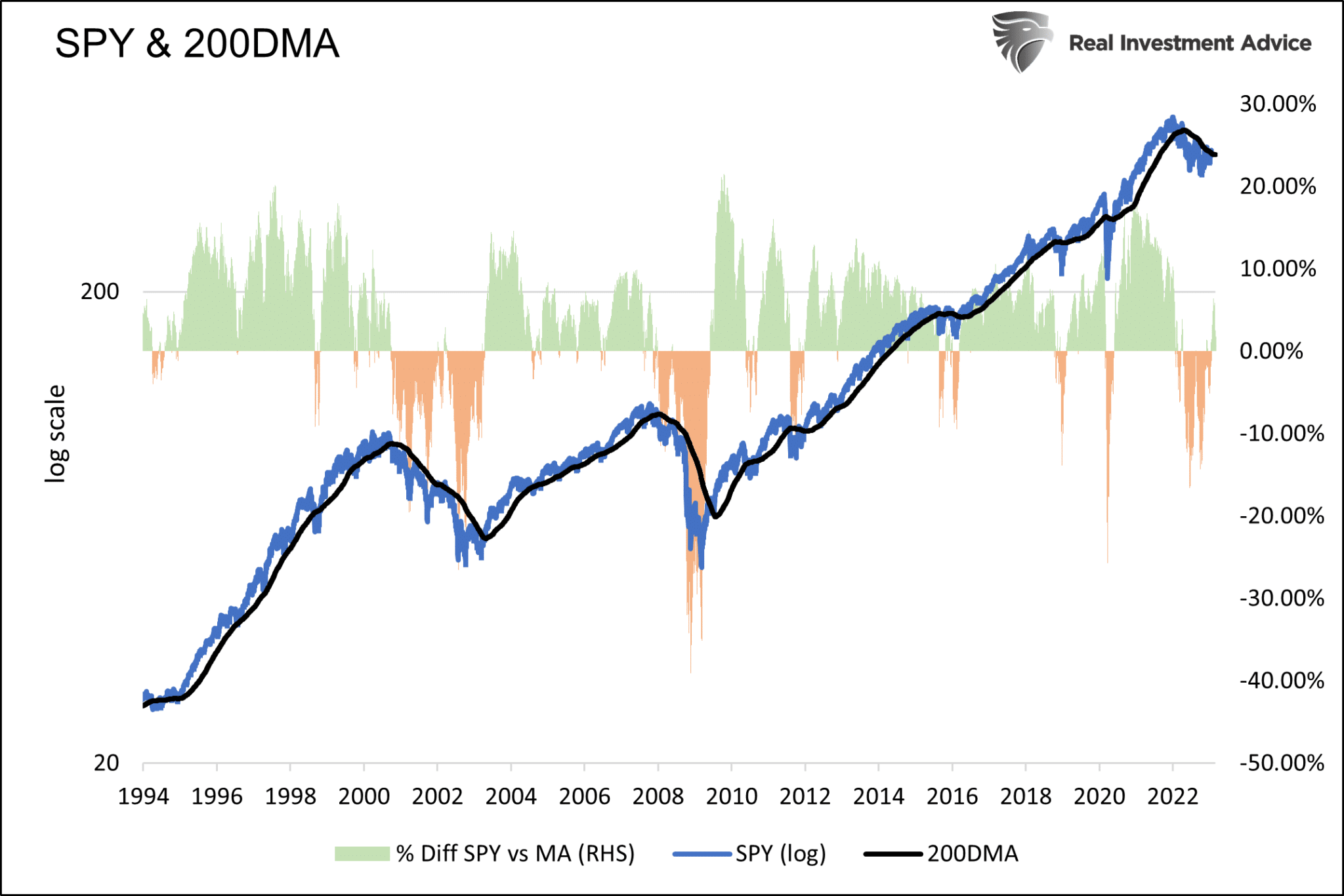
Given the importance of the 200-DMA, we present the graphs below. The first short-term graph shows the S&P 500, its 200-DMA, and the slope of the DMA. Slope quantifies the rate and direction in which the 200-DMA is headed.
The most bullish trend occurs when the S&P 500 is above its 200-DMA and the slope is positive and rising. The graph below provides guidance on where the S&P 500 sits versus its 200-DMA.
