There’s No Free Lunch: Increased Central Bank Risk-Taking Raises Alarms
2023.09.07 03:33
A couple of months ago, in this , I argued that one characteristic of higher- environments is that the volatility of inflation numbers is also high.
While it does not automatically follow that high inflation volatility implies that inflation itself will remain high, it is suggestive that cries of relief for the end of the inflationary episode might possibly be premature.
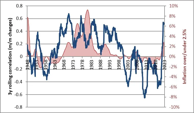
Today, I expected to make a similar observation about correlations, but as you’ll see, my investigations took a different turn. Previously, I’ve noted that when inflation rises above roughly 2.5%, stocks and bonds tend to become correlated – which messes up a key part of the value of a 60-40 portfolio.
Here’s an updated version of my favorite chart illustrating that phenomenon. Sure enough, now that inflation has been above 2.5% for 3 years, correlations between stocks and bonds have returned to what they were back when inflation last mattered to investors: the 1965-2000 period. This has happened before, and it really isn’t surprising.
But it’s more than just stocks and bonds. I recently had the opportunity to look at the three-way correlations between stocks, bonds, and commodities. It is very unusual for all three of these correlations to be positive with each other: stocks to bonds, bonds to commodities, and stocks to commodities.
Generally, if you average those three correlations, you get something positive, but right now, the rolling 12-month correlations of those three asset classes average nearly 0.8.
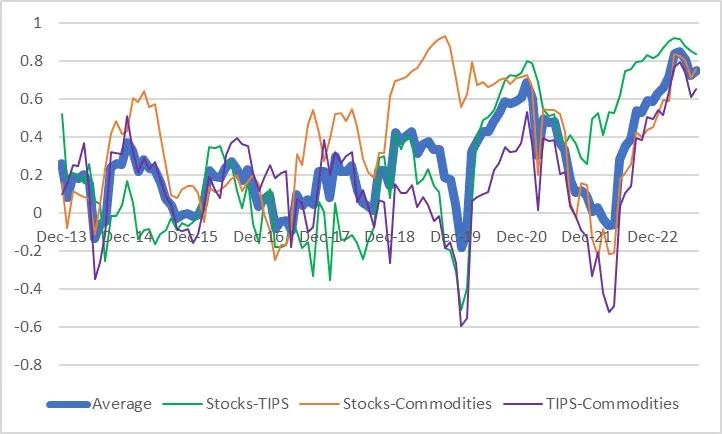 Correlations between Stocks, Bonds, Commodities
In fact, the recent peak in this average of the three correlations (the heavy blue line) is the highest since TIPS was first issued in 1997.
It’s a little strange when you think about it: rising inflation ought to be bad for stocks and bonds…but good for commodities! But because we are looking at rolling 12-month correlations, it’s actually more about the cointegration of financial markets.
Commodities can go up over time while bonds are going down, and they can still be correlated month-wise as long as the commodities’ ups are bigger and the downs smaller than the bond’s ups and downs.
See the following hypothetical example where bonds fall 61% and commodities rise 124% in a year, but they have a 0.91 monthly correlation.
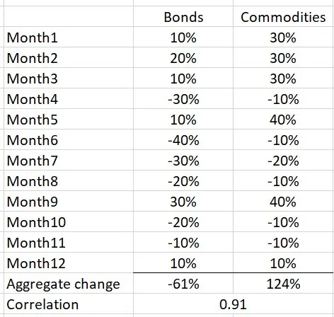
Bonds vs Commodities Correlation
So, while the high correlation is not unrelated to being in an inflationary period – after all, unless stocks and bonds are positively correlated, you couldn’t get the average to 0.8. I think it’s more likely to indicate how markets are just chips floating about on the tide of the global liquidity cycle as it flows in and out.
This hypothesis is reinforced (although it remains a hypothesis!) when we back up even further and look at these correlations going back to the 1960s. To do this, we have to use the Enduring Investments synthetic TIPS return series. When we do this, we find out that three-way correlations haven’t been nearly this high going all the way back to 1960.
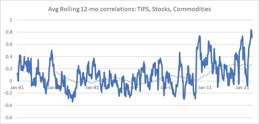 Avg Rolling 12-Month Correlations
The overall level of correlation has been generally rising since approximately September 2008. Interestingly, that’s approximately when the Federal Reserve first started the waves of QE. Coincidence?
It’s even less ambiguous if you look at rolling 36-month correlations. Since the Global Financial Crisis, the correlations have almost always been higher than the highs from the prior five decades.
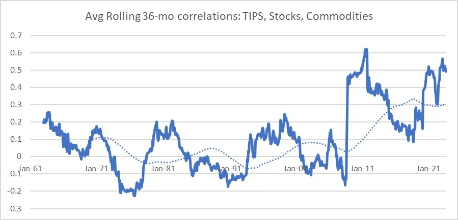 Avg Rolling 36-Month Correlations
It isn’t like we needed more evidence that the Fed’s heavy hand has changed markets. But it is always a good reminder that there is a cost to the endless money fountain.
While central bank largesse may undergird returns (at least most of the time), it does so while increasing portfolio risk by increasing asset class correlations. There is no free lunch, indeed, even when it looks like there is.


