Commodities on Top, Equities at Risk: What Future Returns Could Look Like
2024.11.05 02:56
So you’re probably thinking —given the US election is hours away (from the time of writing), that this note is going to be yet another blab of blibber blubber about what to expect with the election.
But there are a couple of things on my mind that I think should also be on your mind. This is note is therefore more bigger picture, more longer-term focused, and I would say much more useful for asset allocators and those who’re not completely caught up in the short-term noise/news.
We’re of course talking about asset class expected returns.
This is an area that can be a bit controversial because the mechanics of the math with these things tends to result in sometimes deeply contrarian outputs, and hence will often hurt feelings and present dissonance with deeply-ingrained recency bias.
For instance, bond market expected returns —which are heavily driven by yields— will often be the highest after the most significant mark-to-market losses (and thus the best forward-looking returns will arise when people are most disgusted and disappointed with recent bond returns).
Likewise, stock market expected returns will see even the most optimistic earnings growth projections swamped by shriveling dividend yields and eyewatering valuations —precisely when investors are most in love and enamored by equities. So telling people to expect negative returns when they just lived through one of the most enriching and near-uninterrupted bull markets in recent history can be a tough pill to swallow.
A big part of that is recency bias: people tend to overweight their recent experience and extrapolate it forward. Narratives and stories are formed, which may well have a strong initial grounding in reality, but become irrelevant as the fundamentals get priced-in and then some, with valuations far overshooting even the most optimistic fundamental scenario.
To make matters worse, these narratives and stories also get so strongly anchored and inculcated that when the fundamental reality begins to turn and shift (as it almost always eventually does) the crowd remains fixated on a former dream of what could be… and suddenly find themselves adrift as the earth slowly but surely moves from under their feet.
So with all that preamble, let’s take a look at where the latest run of capital market assumptions are sitting (from the October Market Cycle Guidebook).
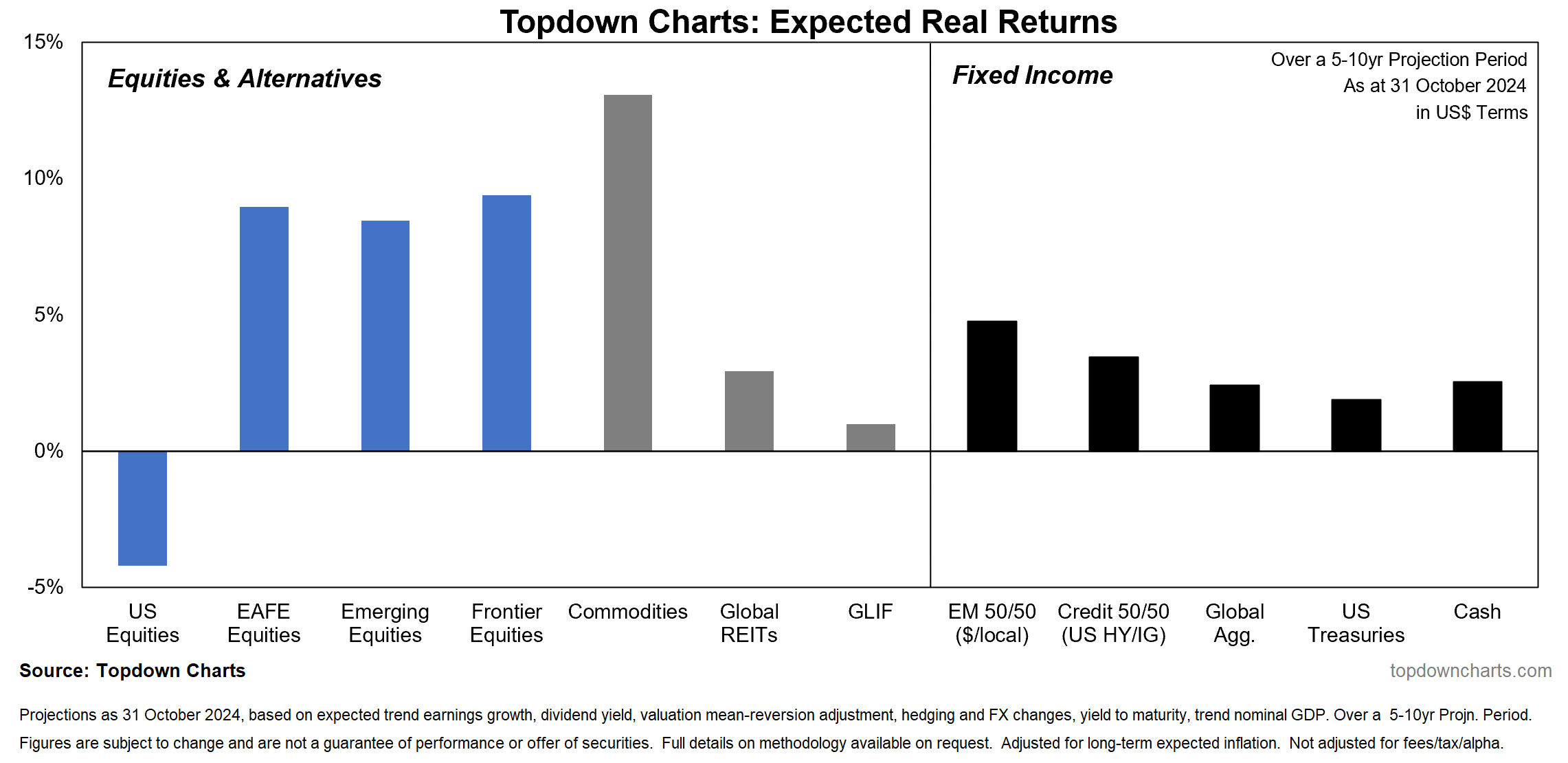
Commodities are projected to come out on top, US equities on bottom (with real returns potentially negative); global equities are expected to beat US equities (with likely strong positive returns), and the riskier end of the fixed income spectrum likely does marginally better than treasuries, while cash and bonds are projected to provide a positive real return (making for a negative expected equity risk premium i.e. the spread of US stocks vs US treasuries is negative and FYI it was strongly positive back in March 2020, which turned out to be a solid tactical + strategic signal — so there is some historical predictive value here).
Again, the below table probably stands at odds with what has done well recently in your portfolio, and probably you don’t agree with parts or all of it, and it will likely be wrong in some respects but have you considered the below as a possibility? What if things did end up turning out this way?
Key point: The coming years asset class return landscape is likely going to look quite different to that what most people have grown used to over the past few years.
Concepts and Context — Global Equities Expected Returns
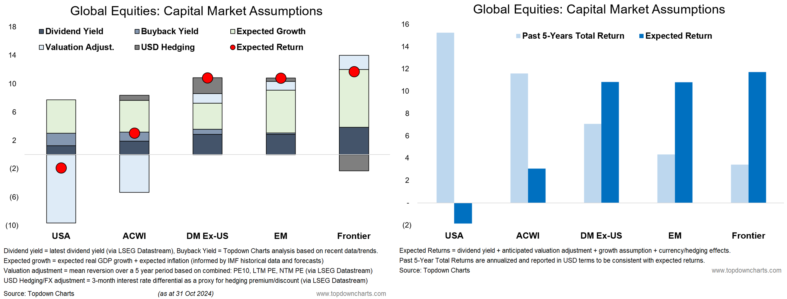
Given all that I mentioned above, and the rather stark reading at the left-hand side of the chart (probably the least believable for most people, if I had to guess), I thought it might be useful to share a couple more charts which provide a look at the concepts and inputs/breakdown for the equity expected returns, but also presents some historical context (e.g. how the past 5-years total returns compare to the forward-looking return expectations).
First, in terms of the components, the equity expected return outputs are the sum of: dividend yield (+buyback yield adjustment) + expected earnings growth + valuation adjustment + USD hedging/FX adjustment (for global ex-US).
In other words: income + earnings growth + valuation change. Historically the income part tends to be reasonably steady, the earnings growth mostly positive (except for recessions), and valuation changes can be either a big contributor or sometimes large detractor to returns.
As the chart on the right below shows, the US stock market has turned in exceptional returns over the past 5 years, and this has resulted in historically stretched expensive valuations. Given the tendency for valuations to mean revert over the longer-run (cycles!) this means “valuation change” is likely to be negative over the coming years (the growth story is already in the price, and then some).
The main way these figures could be wrong would be if valuations stayed higher for longer, and/or if growth continued to surprise to the upside and out-punched any downside valuation change hurdle. But even then, we’d probably be talking modest returns vs negative returns, and certainly not a repeat of the past 5 years.
So it’s a prompt at the very least to think: “what if?“ —my discussions with institutional investors and wealth managers is that there is heavy pressure (peer-risk/career-risk) to walk the straight and narrow of US large cap stocks (and within that to stay very close to the index/passive). Again, even if you understand the intellectual argument, it’s a tough pill to swallow, and not what most expect.
Original Post


