5 Essential Charts to Understand Inflation and Risk Assets Today
2023.03.20 15:31
In this week’s newsletter, we’re going to provide you with an inflation update based on some of last week’s important data releases and also share some general thoughts on risk assets and liquidity.
Let’s dive right in:
GMI Chart 1 – US PPI YoY% vs. US CPI YoY%
came in sharply below consensus expectations in February (4.6% vs. 5.4% expected) and now targets closer to 4% in the next one to two months.
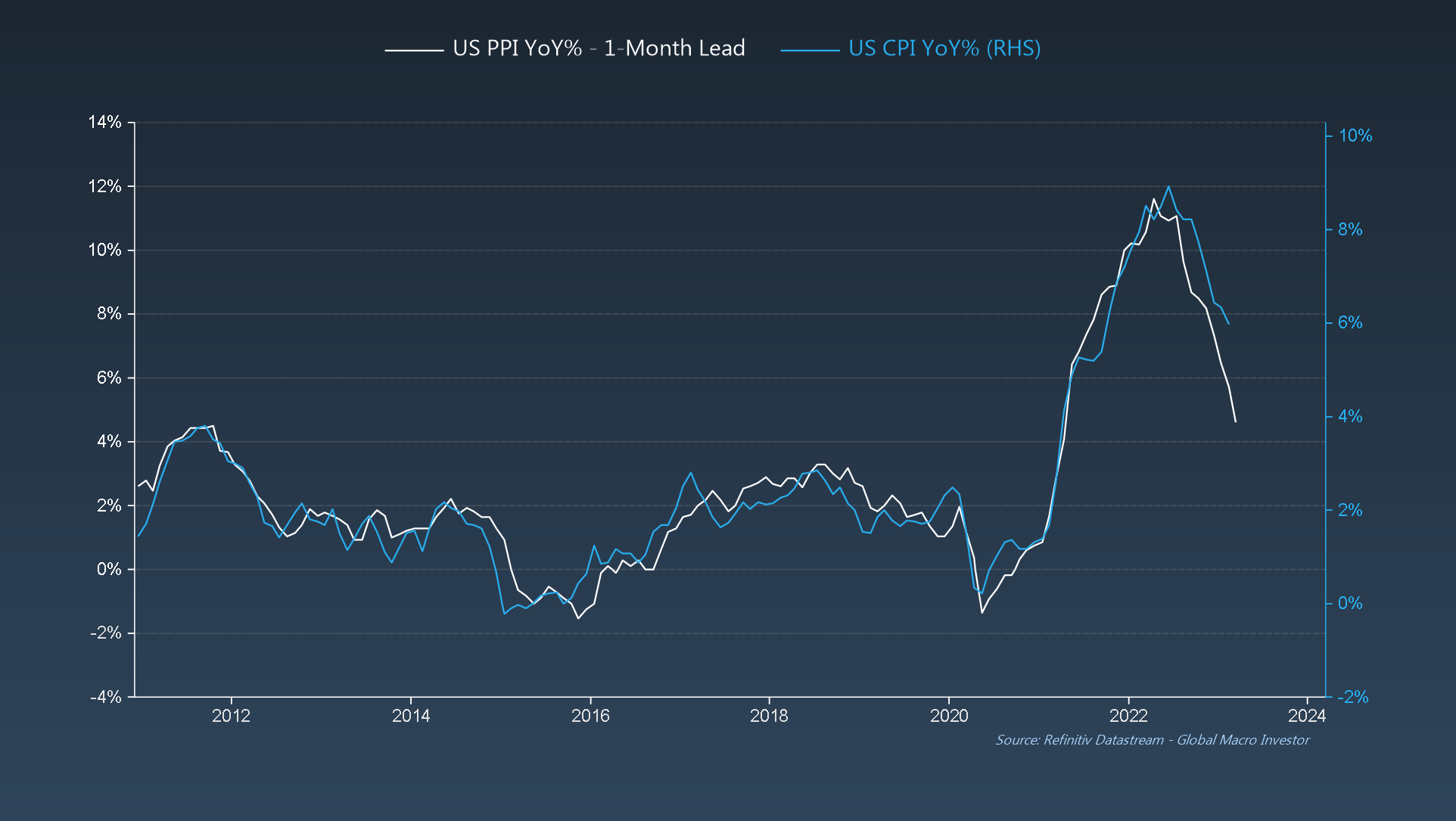 U.S. PPI 1-Month Lead/U.S. CPI YoY%
GMI Chart 2 – University of Michigan Median 1-Year Inflation Expectations vs. US CPI YoY%
University of Michigan indicate the same.
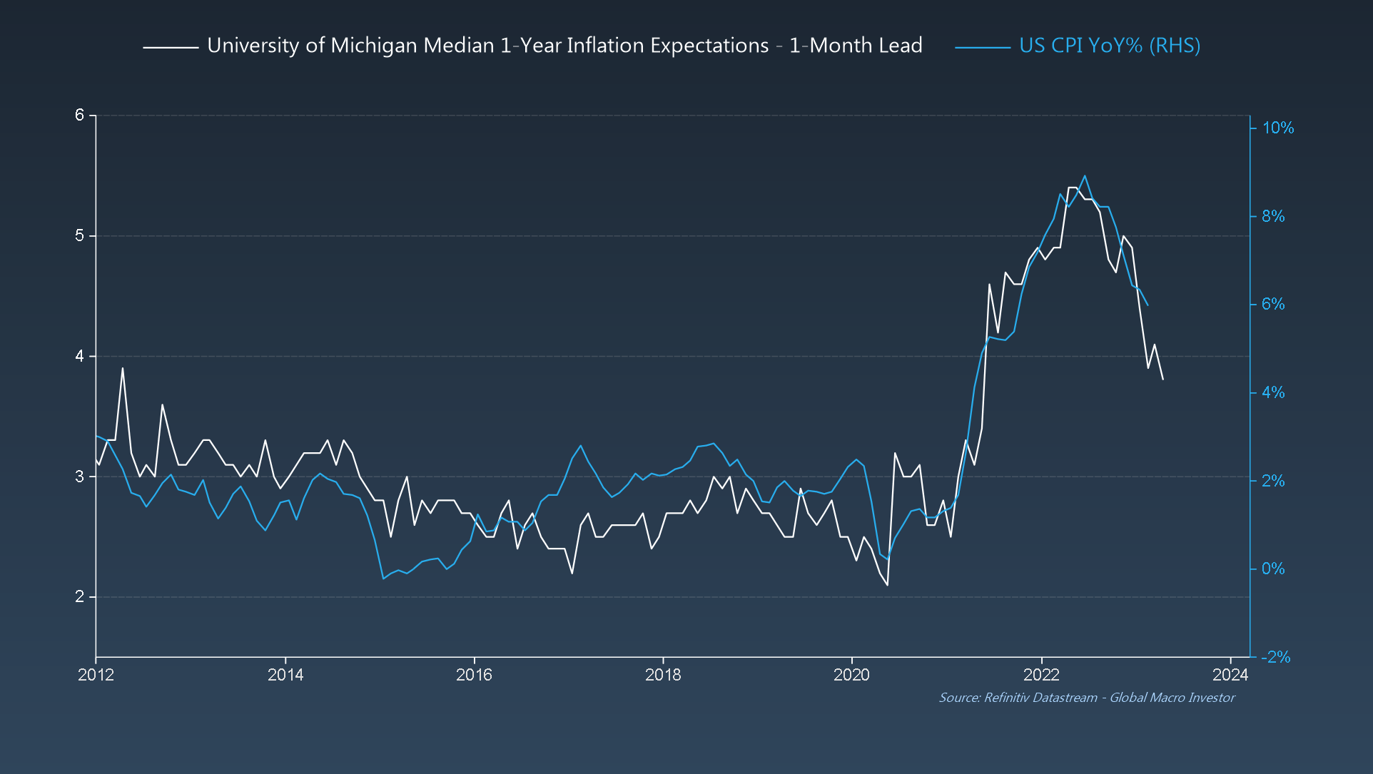 U. Mich. Median 1-Year Inflation Expectations
GMI Chart 3 – NFIB Small Business Survey: % Reporting Higher Prices vs. US CPI YoY%
Last week saw the release of the latest data for February, where small businesses continue to report a rapid decrease in price pressures.
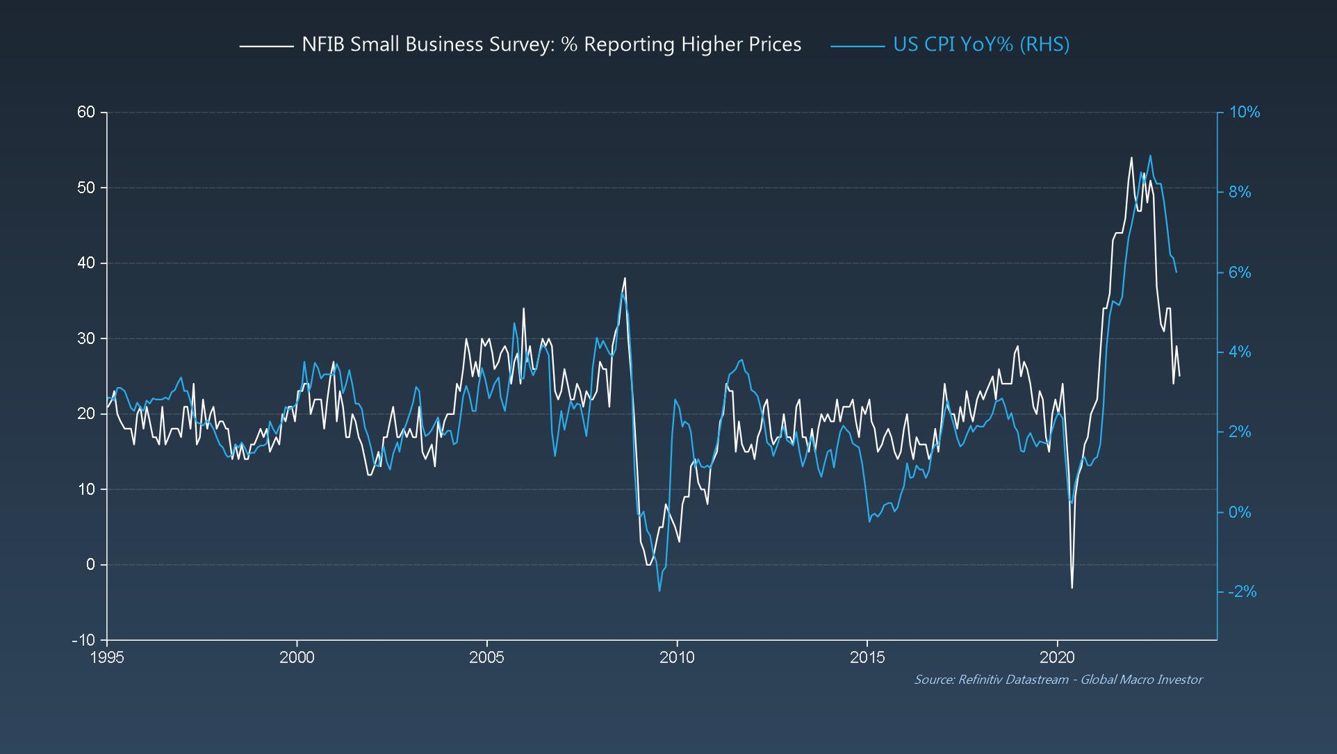 % of Small Businesses Reporting Higher Prices Vs. CPI YoY%
In addition, inventories are still way too high, hence inventory satisfaction levels continue to collapse.
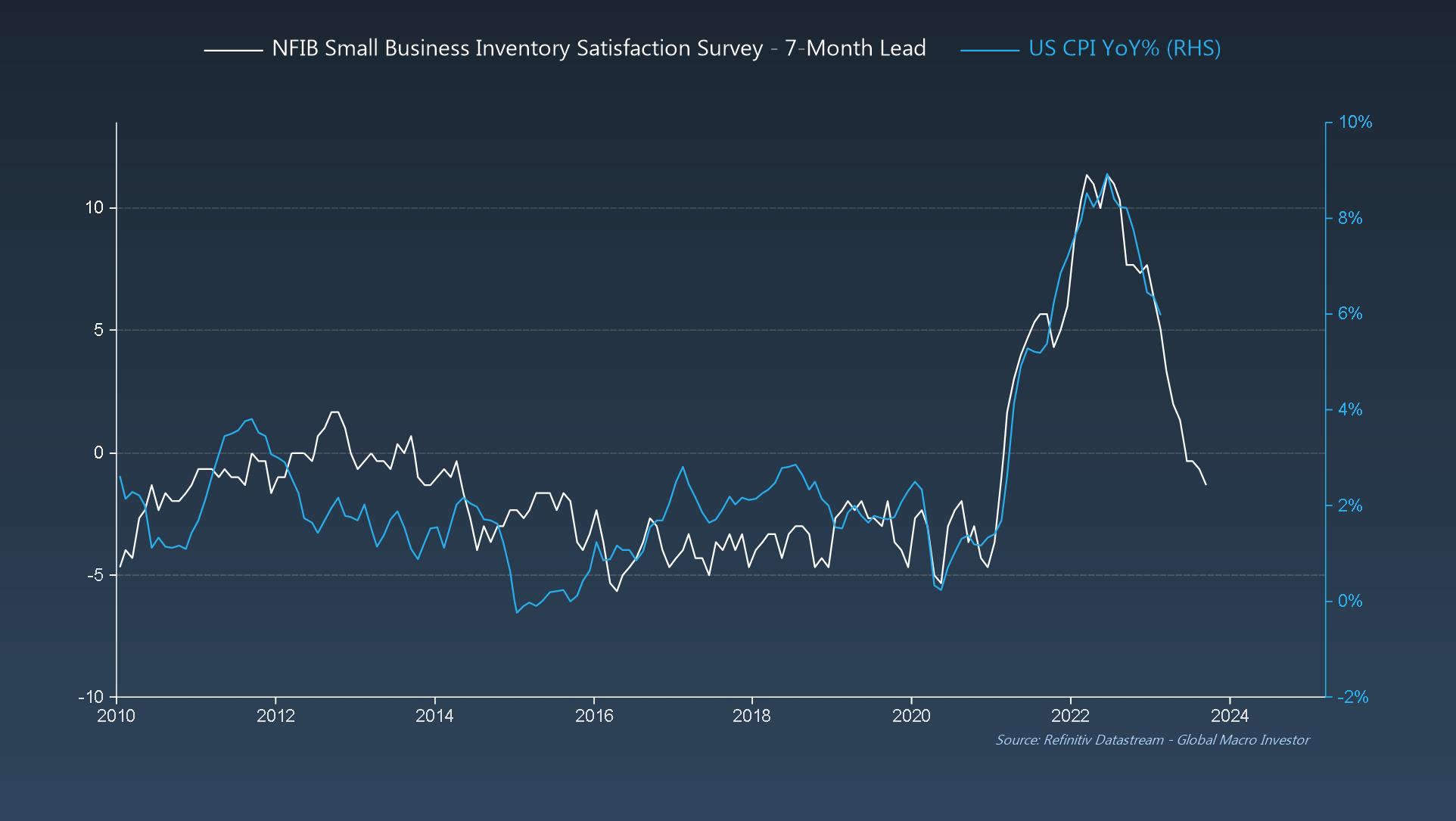 Inventory Satisfaction 7-month Lead Vs. US CPI YoY%
GMI Chart 4 – NFIB Actual Compensation Changes Past 3-6 Months vs. NFIB Compensation Plans
Also, despite ongoing concerns over wages being “sticky,” small business compensation plans continue to deteriorate, and actual compensation changes just lag by around a quarter: wages have peaked.
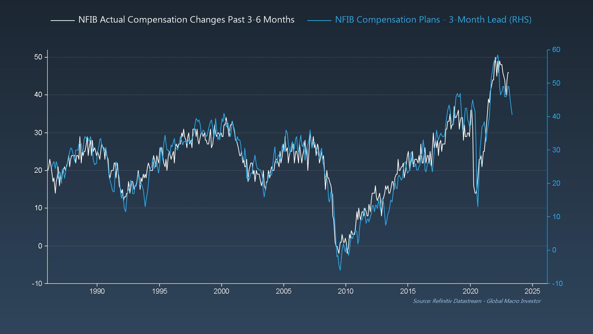 Actual Compensation Changes Past 3-6 Months Vs. Compensation Plans
Our own GMI model indicates the same: wages aren’t “sticky,” they’re just extremely lagging.
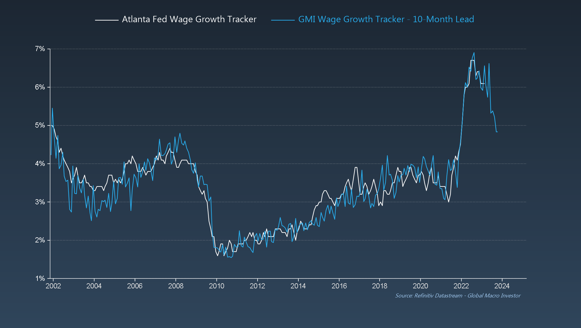 Atlanta Vs. GMI Wage Growth Trackers
GMI Chart 5 – NY Fed Global Supply Chain Pressure Index vs. Global Citi Inflation Surprise Index
Lastly, global inflation surprises are about to turn negative over the next couple of months and we see few people mentioning this.
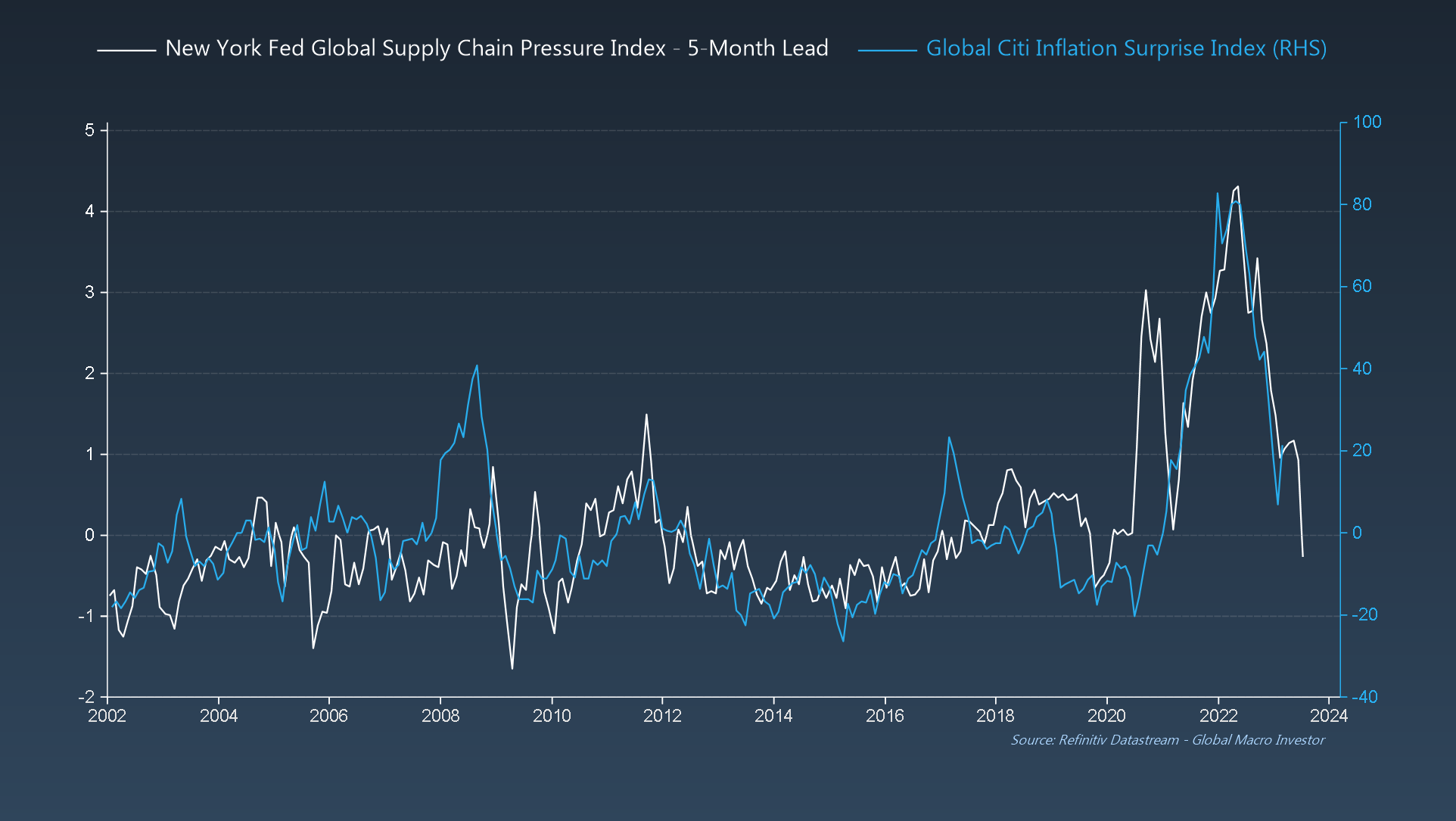 NY Fed Global Supply Chain Pressure/Global Citi Inflation Surprise
The GMI Big Picture
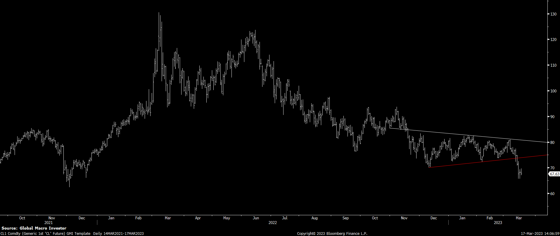
Despite all the inflationistas talking oil breakouts every time trades higher for two or three days, our call at GMI was that we would see $60 before the next turn higher, which has been our core view since May of last year at our annual GMI Round Table event.
Just this week, we saw a break, down from a near-perfect symmetrical triangle continuation pattern we had been watching, which targets a move exactly down to $60.
The bottom line is that inflation will continue to slow and that the decline should really start to accelerate from here – it’s all down to the base effect.
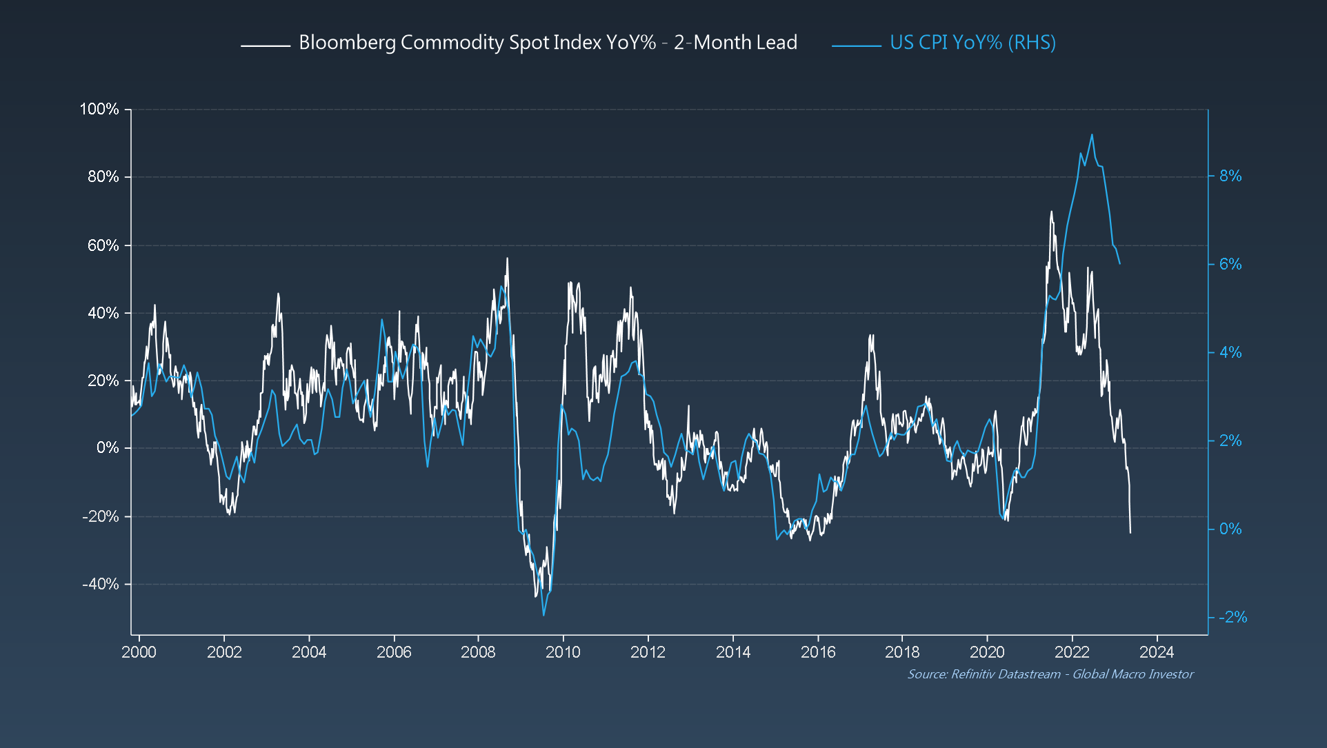 Bloomberg Comm. Spot Index YoY% 2-Month Lead Vs. US CPI YoY%
Our view has been – for quite some time – that this would be positive for risk assets.
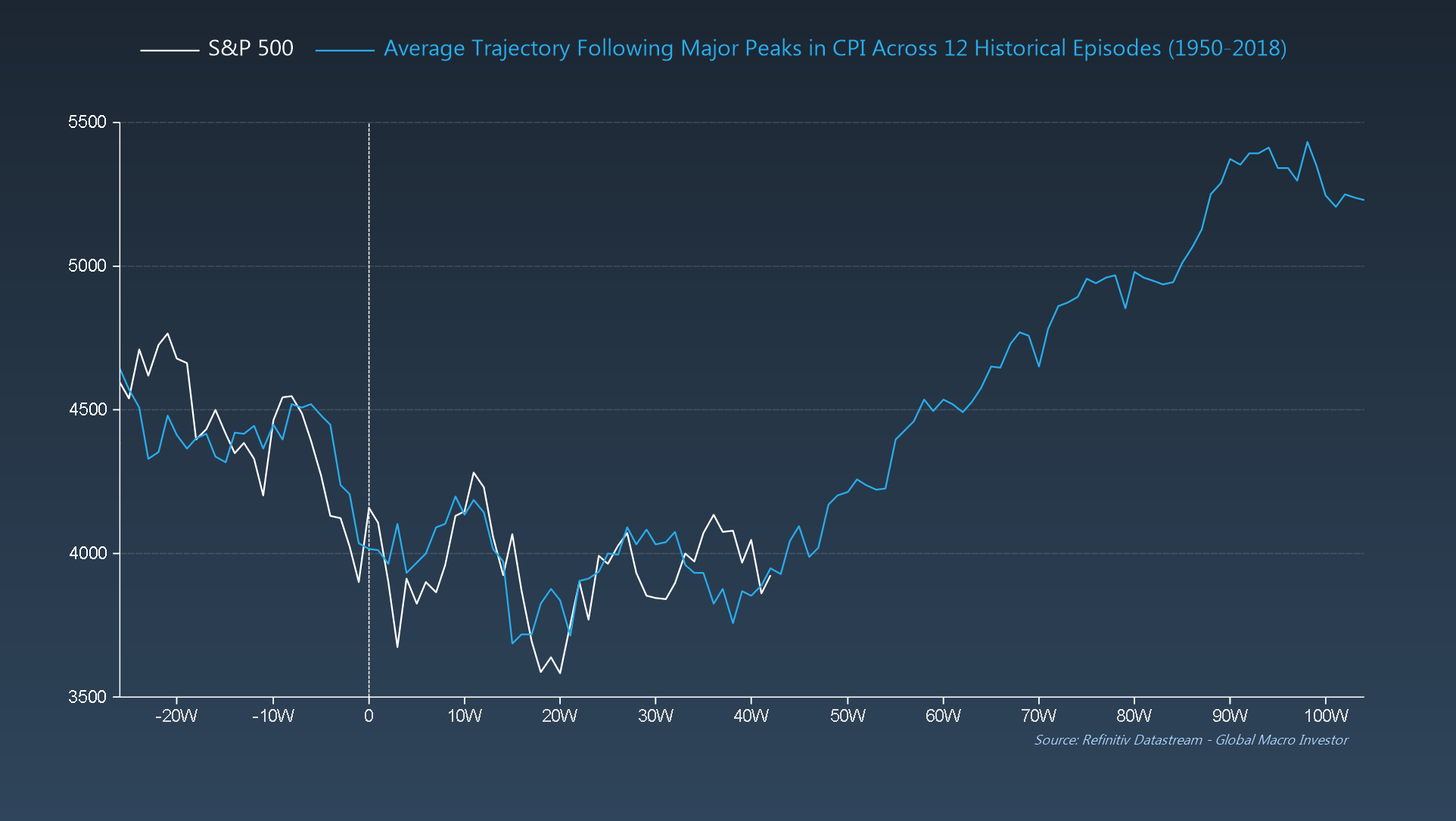 SPY After Major Peaks in CPI
Clearly, the next few weeks will be the real test. It’s pretty clear after what happened to Credit Suisse (NYSE:) this week, with their share price plunging over 30% intraday on Wednesday and their 5-year CDS exploding to 700+ bps, that potential contagion fears over a funding squeeze on EU banks and other big users of the markets are growing.
The important takeaway from all of this is that, while contagion risks are real and deflation risks are rising, the worse things get now, the more the Fed will do – bad news = good news – and more cowbell is on its way.
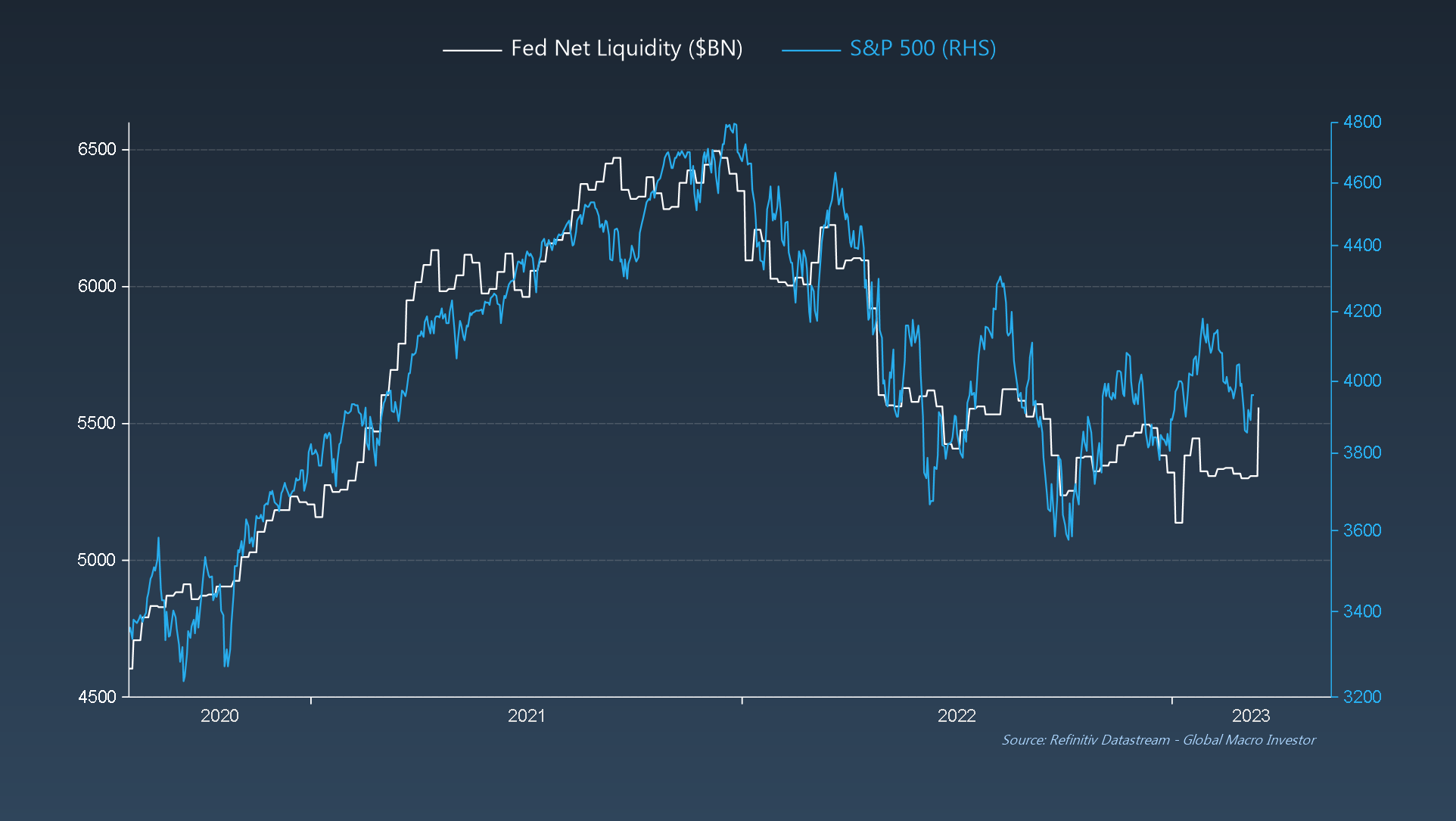 Fed Net Liquidity Vs. SPY
That’s it from us this week. See you all next week.
***
As ever, much fuller and more in-depth analysis can be found in Global Macro Investor and Real Vision Pro Macro. Global Macro Investor is our full institutional research service and Real Vision Pro Macro is the sophisticated retail investor service, which is co-authored with leading research firm MI2 Partners.
Want to read these the moment they come out? Sign up entirely free for my newsletter, Short Excerpts From Global Macro Investor on Substack. New articles published every single Sunday.


