What’s Behind Small Caps’ Lackluster Performance?
2023.07.06 03:47
One of the big questions of 2023 has been why small-cap stocks have performed so poorly relative to the rest of the market. Typically, smaller capitalized stock show outsized returns when the broad market is rallying as investors take on more risk through exposure to typically higher beta smaller stocks. One of the most popular gauges of risk appetite is the performance of the or to the . When these small-cap indices show strong relative performance, it’s viewed as a positive market development and a feather in the cap of bulls.
That hasn’t been the case in 2023. While the S&P 500 is up double digits, the S&P 600 has barely climbed 5% in the first half of the year. Many traders and market commentators have observed and pointed out the strength in the mega-cap stocks, primarily the likes of Apple (NASDAQ:), Google (NASDAQ:), Microsoft (NASDAQ:), Tesla (NASDAQ:) and NVIDIA Corporation (NASDAQ:). And while these handful of names have accounted for the lion’s share of the gains in the S&P 500, it doesn’t explain why we are seeing such performance disparity from small caps.
As a technician, I’m focused on the supply and demand of the market through the evaluation of price charts. I’m less concerned with “why” a market, sector, or stock did something as it relates to news events or headlines. I prefer to allow the price action to digest those headlines and analyze the resulting changes on the chart.
One chart that’s recently helped me better understand what’s taken place in the lackluster small-cap relative performance is looking at market history, specifically the changes in interest rates.
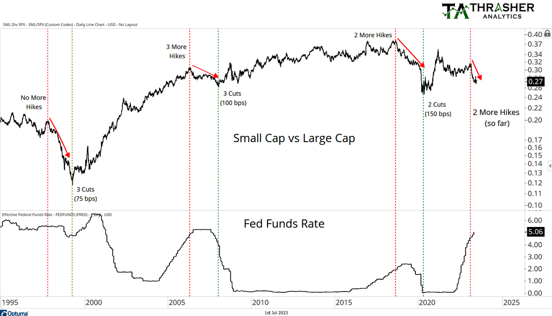
The chart below shows the S&P 600 vs. the S&P 500 since 1995, with the Fed Funds Rate in the bottom panel. What I find really interesting is how it’s actually not that uncommon for small caps to underperform after the Fed has been raising rate. In fact, each time in the last nearly thirty years, the S&P 600 underperformed when the Fed was nearing the end of its rate hike cycle.
Most recently, when the Fed had two more hikes left, small caps peaked relative to large caps. Before that, the Fed had been hiking for several years and squeezed out 3 more hikes after we saw large caps take over in relative strength. Fast forward to today, the S&P 600 has struggled relative to the S&P 500, and the Fed has hiked two more times and now is believed to be on a “pause” with the door still open for them to hike some more.
 Small vs Largecaps and Fed Funds
What does market history tell us about when this trend in small-cap underperformance ends? Well, historically, the Fed has started its cycle of lowering rates before we finally see some reprieve. The three examples shown above ranged from 3 cuts of 75 basis points to 2 cuts of 150 basis points which finally broke the downtrend in small vs. large caps. While this is a very small sample size, it does paint a clearer picture and give some degree of explanation as to why we haven’t seen stronger performance in small caps this year.
Disclaimer: Do not construe anything written in this post or this blog in its entirety as a recommendation, research, or an offer to buy or sell any securities. Everything in this post is meant for educational and entertainment purposes only. I or my affiliates may hold positions in securities mentioned in the blog. Please see my Disclosure page for full disclaimer.


