2 Charts for the S&P 500 Nobody Talks About
2023.12.05 14:17
Those who read our articles regularly know we primarily focus on the Elliott Wave Principle to forecast where the stock market will likely go next. However, for our premium members, we also follow market breadth, sentiment, seasonality, etc. Although price is always the final arbiter, these -secondary- items can significantly help us in providing an objective weight-of-the-evidence approach.
In today’s update, we will look at two types of market breadth charts to assess the overall health of the market under the hood.
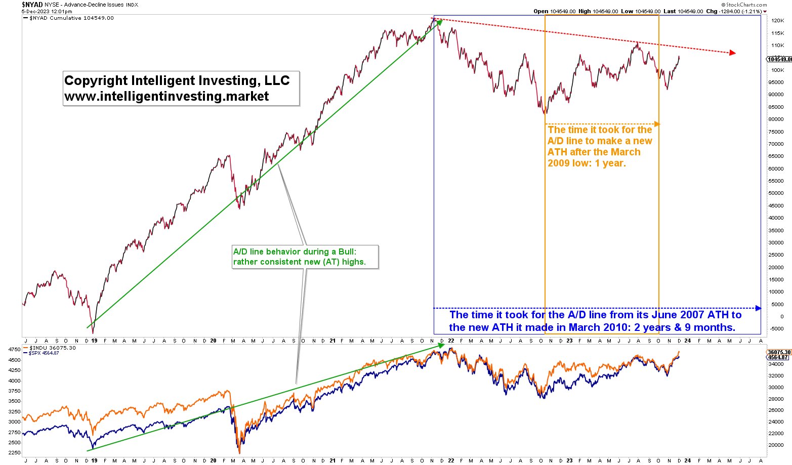
The first is the cumulative Advancing-Declining Line (NYA/D). Surprisingly, few market pundits have lately mentioned the lagging NYA/D. However, it is a crucial tool for any analyst as it is essentially a measure of liquidity, e.g., does the rising tide lift all boats? Namely, the A/D line has not made new all-time highs (ATHs) since November 2021 and is about to enter its longest stretch to do so since the 2007 market top. That in and by itself is concerning. See Figure 1 below.
Figure 1. Cumulative Advancing-Declining Line (NYA/D) since 2018.

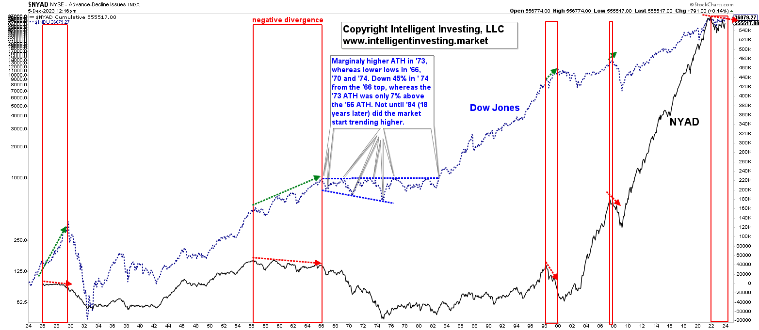
Moreover, all significant market tops (1929, ’66, ’69, ’73, 2000, and ’07) were foreshadowed by a lagging A/D line (higher prices but lower A/D readings, aka “negative divergence”). See Figure 2 below.
Thus, even though we have not seen new ATHs in any of the major indexes since late 2021 and early 2022 either, which by itself is already concerning as it is the longest stretch since the March 2009 low for the US stock market to go with new ATHs, the currently lagging A/D line is additionally concerning because a healthy Bull is hallmarked by an equally healthy (rising) A/D line.
Figure 2. Cumulative Advancing-Declining Line (NYA/D) since 1926.
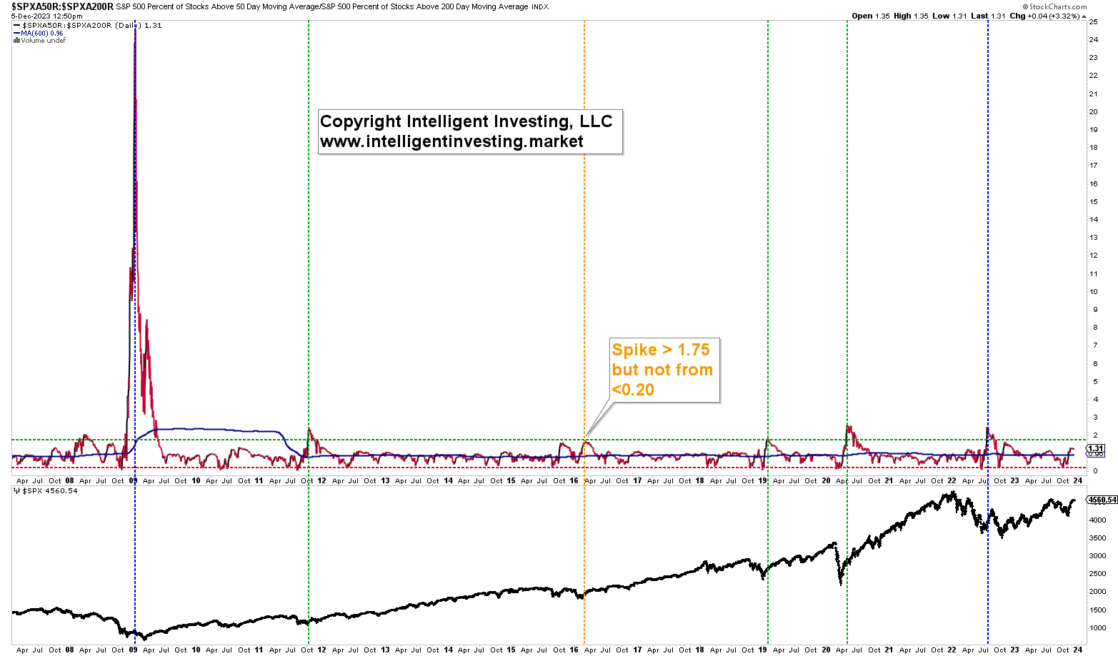
 The second is the ratio of the percentage (%) of stocks above (>) their 50-day simple moving average (d SMA) and the % > 200d SMA (SPXAR50/200). Although we have data available since 2002, we focus on the Bull market since the 2009 low and find that every multi-year Bull run after a correction has seen the ratio spike from 1.75. Currently, the ratio is only at 1.31. See Figure 3 below.
Figure 3. S&P500 % stocks >50d SMA / S&P500 % stocks >200d SM
 Namely, besides two false signals (dotted blue lines) where we did see a spike from 1.75, but the then dropped directly after (January 2009 and August 2022), three occasions kicked in -sometimes multi-year- Bull runs—the green dotted lines: 2011, 2019, 2020. Only on one occasion (2016, orange dotted line) did we see the SPXAR50/200 spike over 1.75, but it didn’t start from below 0.20. Regardless, we did get a two-year Bull out of it. Lastly please note the difference between the 2009 spike and all others since. Thus, the 2009 low was of much more significance than any other low since. Even more so than the 2020 COVID-crash low and the recent October 2022 and 2023 lows.
Thus, every Bull run since the 2009 low was preceded by a spike in the SPXAR50/200 ratio over 1.75, preferably starting from below 0.20. However, the recent October 2022 and 2023 lows didn’t even register such a spike. Combined with the lagging NYA/D line, we can conclude that based on the data at hand, the current rally does not have the underlying hallmarks of a long-lasting Bull.


